
Best marketing practices for online food stores
Selling food online? It’s a tough and crowded market. Location, delivery times, product presentation and differentiation are huge problems for most online food stores.
However, since ecommerce is taking over every type of product and – let’s face it – people are not going to stop eating – you’re in a lucrative niche and have high chances for a thriving business.
To help you sell more of your food items, we gathered best practices from successful online shops from around the globe selling healthy food, ready-made meals, tea, fresh juice, supplements, pet food and more.
They include examples of site design, product page experience, brand image, pricing and many more marketing tricks.
These best practices will help you compare yourself and the customer experience you provide, as well as inspire you to build a strong and likable eCommerce brand.
Launching a food brand? Check out our resources on:
Food packaging for the modern brand
Partnership ideas to extend your reach
Report: Ecommerce food brand stats
Case studies: Coffee / Fresh juice / Fish
Food marketing online
Content for food eCommerce stores
You know that basically there are two kinds of sellers in commerce: basic sellers who just list products on sites and those who provide value for their customers.
Needless to say, the second can charge more for their products and be more profitable.
Baby Bullet uses content to inform and educate its audience not just about baby feeding, but about parenting in general. There’s a really good connection between the product and the topics without overselling.
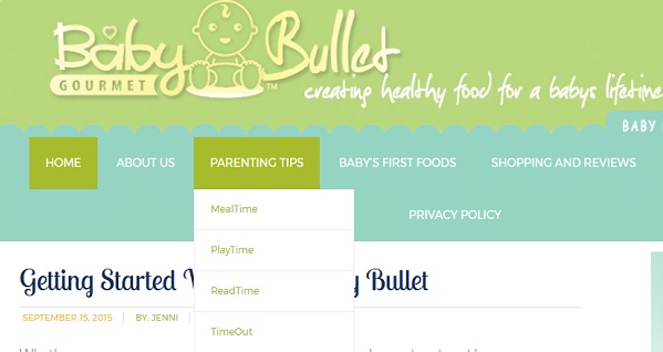
Their site turns into an info resource and go-to page instead of just a product listing. That’s how authority and loyalty are born.
Read more about content marketing for online stores
Provide value for free and happily
The team behind Paleo Choice understand well that people need a lot of information when it comes to diets and food restrictions.
To make anyone – not just ready shoppers – welcome on their site, they the 3 main purposes of the site at the top, easily accessible:
“I want to read about Paleo lifestyle”, “I am looking for Paleo recipes” and “I want to buy paleo foods”.
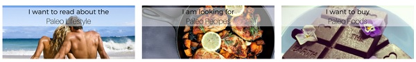
This simplifies the choice for the first-time visitor and makes them feel welcome and that curiosity is a good thing.
Make your preferred product the logical choice
Want to get bigger orders? Bundles are the best way – they look a deal to the customers (so they’re happy) and make them spend more (you’re happy).
To lead them to buy the bundle, make it the most prominent thing on your home page.
That’s what Aroma Zen does on its food delivery site – their office catering offer is the best deal there and visitors don’t need to look at anything else. Smart placement is all it takes to convert fast.

Meet objections out right
Innovative and unconventional products can sparkle many questions and reservations from potential buyers.
To make them trust you and switch to your products, answer them right away and as fully as possible.
This will gain you points for openness, authenticity and will decrease the risk for your new customers – after all, they’re buying food to put in their bodies (or their pets’ bodies, which is equally important).

Benyfit Natural covers all kinds of objections they anticipate with a range of informational resources: ingredients list and benefits, team bios and certifications, a FAQ page, expert panel, and testimonials.
It shows you know what you’re doing and that you stand by your product.
Choosing guide
That one’s so easy to do and still, only online shops with a premium customer experience do it. ![]()
Natural Warrior Tea helps their customers choose the right kind of tea for their needs with a simple table that lists levels of caffeine, benefits, and effects on the body.
This way, they make sure the customers will be happy with the product, ensuring positive reviews, loyalty and repeat orders. It doesn’t have to be complex to work so well.
Plus, this tactic saves on support time and helps people place an order fast.
Food shop site design best practices
Full ingredients list
It’s extremely important for proprietary food products to explain what’s in them. This is what sets them apart from the conventional options and the strongest sales points.
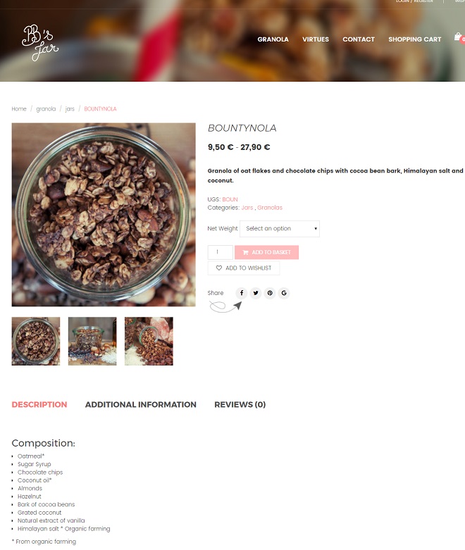
BB’s Jar doesn’t hide any of the ingredients in its granolas and for its target audience this is key – to know what you eat.
An added bonus is that people start salivating as they look at pictures of food or even read a yummy list so your chances for conversion increase as you add more details (I am craving a Bountynola right now.)
Price ranges
You can speed up the buying process by making choices available as early as the category page.
Binney Bar does a cool thing showing two different prices right on its category page so the visitor can easily get a feel for the pricing and options.
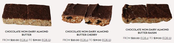
Displaying both prices for a 6- and a 12-pack is convenient before customers even open the product page.
It catches the attention of indecisive customers and they might be comforted by the different size options available.
More on how to convert hesitant shoppers here
Product pages complete with recipes and nutritional info
Although it sounds too much, what are people interested in about food? It’s nutritional value and how they can consume it!
If you sell lettuce, fine, people know how to cut it into a salad. But when you sell vegan superfood shake, they might need a bit of inspiration for including it in meals and drinks.
Sotru provides all this info and specs so its customers can make an informed choice.
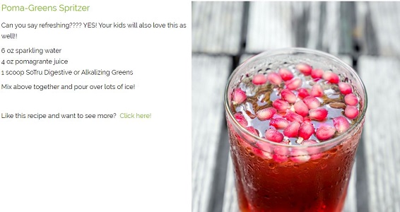
Usually, the people buying food and supplements online are really invested and knowledgeable on the topic of nutrition so they’re not easily fooled – and they read all labels thoroughly.
Priority filters
A good way to show that you’re really thinking about your customers is applying their logic to the site’s category navigation, following the way they would look for items.
When selling healthy food online, it’s basic but effective to categorize by dietary requirements before anything else.
Soil lists a longer selection of dietary restrictions than we can certainly name. It makes choosing a lot easier and safer.
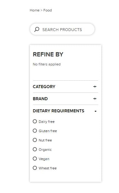
Bonus: Check out the consistent brand image in their Instagram profile.
Building your food brand online
Solve problems, don’t be a supermarket
Food is a commodity and the fact that people seek alternatives speaks that they have specific problems to solve.
Define the problem(s) you solve upright so they feel they’re not alone fighting this:
“Do you struggle to eat as healthily as you’d like?”
“Do you feel zapped of energy?”

Bamboo Health & Wellness puts its site visitors immediately at easy by creating a safe zone where their deepest problems are not a taboo – the brand understands them and offers support.
Their meaningful categories segmented by purpose also help find a solution that’s not easily articulated: “calm” and “energy range” instead of just “teas” or “supplements”.
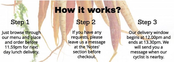
How does it work?
Chances are your products and service need a little explaining. That’s true for most innovative and complex business models – people have questions.
The best practice is to explain how it works and what they have to do right on the home page.
The first thing visitors see on the meal delivery nutri2go’s site is just that – how to order. If you want conversions, why bury the “how”? People find it easy to follow instructions and clean processes.
Presenting your product range
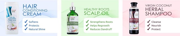
One very good idea from Coco Veda is having a long scroll on your home page where you present all product lines (if that’s not too much, of course).
This helps visitors get familiar with what you offer and see a consistency in your brand.
It shows they’re a serious company with many – professionally branded and packaged – products. What’s more, the design is aligned with the values of the brand – nature, freshness, simplicity, and rawness.
Bonus: The images on the product pages include the 3 main benefits of each product – e.g. alcohol-free, moisturizing, make-up remover so it’s easy for visitors to find what they need without much reading into descriptions.
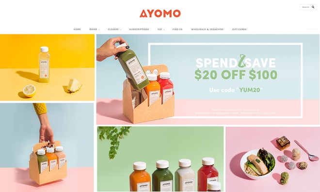
Stunning visual branding
You’re probably tired of hearing this, but ecommerce is a visual trade and food eCommerce – even more so. Your products should look tasty for people to buy them.
Ayomo achieves that saliva-inducing effect with a beautiful color scheme and clean product photos. It’s just the juices, the fruits, and awesome colors.
So don’t worry to invest a bit in professional photography/ classes/ equipment because the visuals stick in people’s heads for longer than any copy.
Community management
If you hope to have loyal customers and an engaged community, social media is key.
To be of maximum help and value, Mason Tops not just puts social buttons on its site.
They explain what to expect from each channel so people engage only in the most positive way. It’s a great idea when you’re not in for the vanity metrics but for providing real value to your following.
Hope these examples inspire you to level up your game!
Selling food online may not be easy, but demand is stable and with a little improvement in customer experience and brand image you’re pretty set for success in eCommerce.
If you feel like sharing your experience, please do so below – we’re happy to discuss best practices in any niche!
Build and grow your ecommerce brand
Metrilo’s mission is to help you build your ecommerce brand and win your place in the customer’s heart. We share what we learn from our daily work with product innovators and founders here. Subscribe to our weekly newsletter to get the freshest lessons and conquer your niche.
We promise, no spam.
Thank you for subscribing!
See you soon :-)
 eCommerce Metrics ebook
Download
eCommerce Metrics ebook
Download
 Ecommerce customer retention in practice
Download
Ecommerce customer retention in practice
Download
 Ecommerce Growth Helper
Visit
Ecommerce Growth Helper
Visit
 Case studies from our customers
Read
Case studies from our customers
Read