Psychology of color: What different colors mean in marketing
To use color for your marketing goals, you need to understand how color works. Colors mean various things so choosing the right one for your visual, email, etc. that says what you mean can be tricky.
Psychology of color or color symbolism is how colors play on our subconsciousness to trigger certain associations. It is especially important in ecommerce, which heavily depends on visual branding. 85% of people’s buying decisions are influenced by color. This is because they can only see, but not touch or smell or your products. That’s why you should watch the meaning of colors in marketing when creating your visual branding.
We’ll explore the common associations colors trigger so you can find the right colors to use to convey the traits you want your brand to be associated with. Making customers feel or think of s certain thing is called emotional branding, also is important for psychology to reduce anxiety on people and colors help with this, while also using the best CBD oil for anxiety could be a good solution as well. You might already have your logo in certain colors, but you can design your marketing visuals (emails, ads, packaging, collateral, social media images, etc.) and website in colors that make the right impression on potential customers.
We’ll also look at how cross-cultural perceptions of color differ so you use the right colors for your target audience to get the intended idea. Find top-tier slot games at เว็บสล็อต and enjoy the best in online entertainment and big wins.
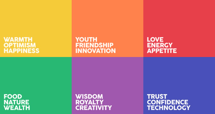
Common meanings of color
These are the most wide-spread interpretations of colors across cultures.
red – love, passion, sexuality; danger, warning, importance; power, speed
blue – seriousness, reliability, stability, knowledge, trust
yellow – joy, sun, childhood, leisure, optimism
green – nature, health, relaxation
orange – energy, balance, enthusiasm, vitality, fun
purple – creativity, spirituality, nobility, sophistication
pink – romance, tenderness, sweetness
brown – nature, wholesomeness, dependability, utility
black – class, luxury, minimalism, boldness
white – purity, innocence, neutrality, peace
grey – security, modesty, practicality
beige – timelessness, elegance, maturity
Colors in business
Using different colors in your marketing such as emails will create different perceptions of your products in the mind of the customer – a sale and a new product launch will benefit from different colors.
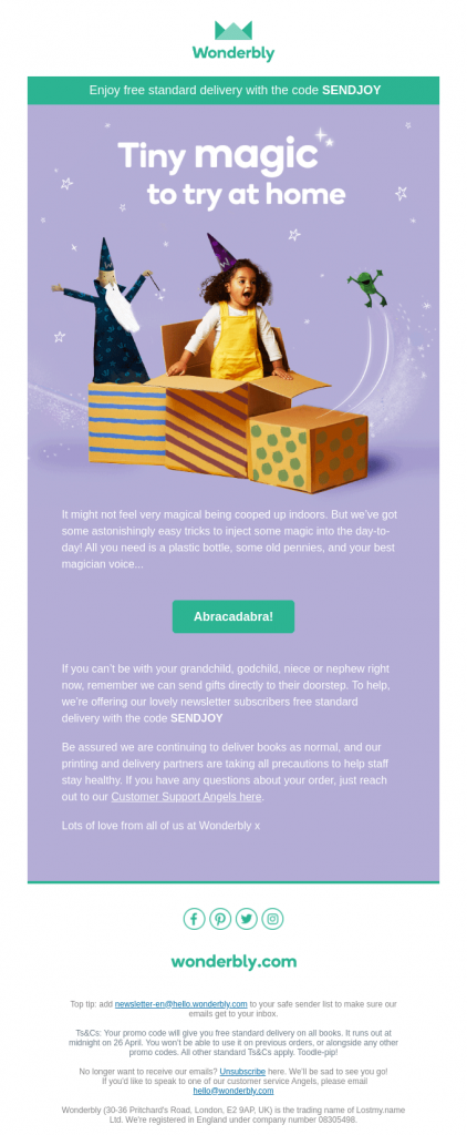
Тhis email from Wonderbly, bursting with bubbly purple (the color of magic and imagination), is a great example how copy, creative and colors should go together.
Here’s what colors to use depending on the purpose of the campaign.
urgency, announcement to be made, promotion, discount – red
reliability, expertise, trustworthiness, know-how – blue
impulse buying, optimism, treat, deal – yellow
eco-friendliness, freshness, healthiness, newness – green
affordability, value for money, urgency to act – orange
graceful aging, luxury, creativity, exclusivity – purple
durability, reliability, authenticity, wood/ leather – brown
high-end, quality, sophistication, class – black
cleanliness, minimalism, simplicity – white
practicality, wisdom, experience, modesty – grey
So if you want to draw attention to your brand’s timeless staple pieces, use white, beige or black. Brown will enhance the authentic feel of a handmade artisan product. New product launch can use green. And if you’re sharing insider know-how content, blue will reinforce you as an authority on the subject.
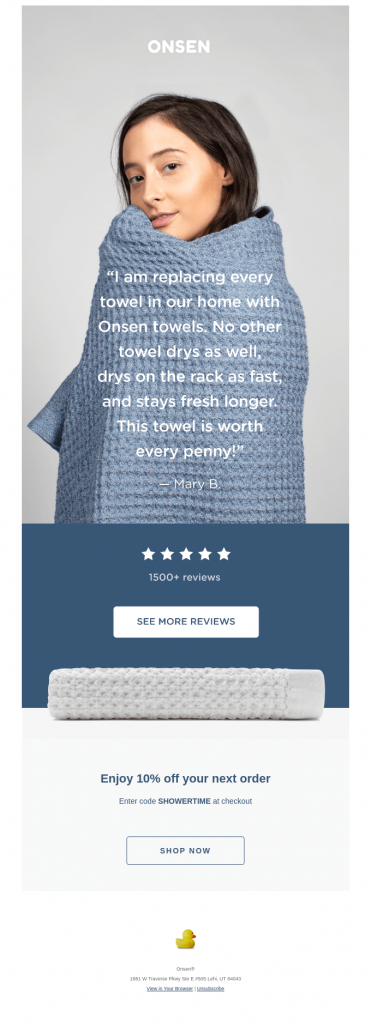
Look at this monochromatic email from Onsen: it’s not just showing the brand aesthetic here but highlighting the expertise invested in creating a superior product (blue) and how practical and a wise decision it is to get your towels from the them (grey).
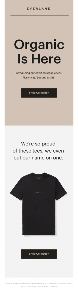
Another example comes from Everlane. They used this earthy brown hue to highlight the naturalness, the authenticity of the fiber used in their organic line. Awesome work on subconscious level!
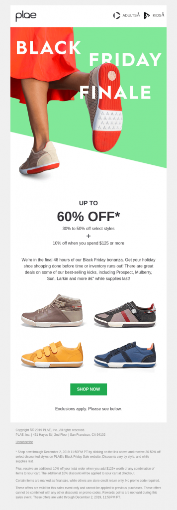
A third example is this Black Friday campaign by plae. They went with orange accents instead of the traditional black for such campaigns and surely stood out in inboxes. Orange signals urgency to shop because the promotion lasts only 48 hours.
Favorite colors by gender
Women like blue (35%), purple (23%), and green (14%).
Men prefer blue (57%), green (14%), and black (9%).
Neutrals (grey, beige, black, white) are gender-neutral as well.
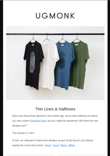
This is great insight if you have separate product lines for women and men and want to do segmentation and tailored campaigns. And also shows how our ingrained assumptions are often wrong – e.g. red is for women. The campaign from UGMONK below shows deep understanding of their target persona – the T-shirt colors showcased are exactly the most preferred ones by men.
As for color combinations,

pastel colors – mindfulness, self-care, spring time, elegance

bright, simple colors – kids, family, value for money, simplicity, straightforwardness

darker, deeper colors – richness, luxury, sophistication, expensiveness
So a spring campaign calls for pastel nuances. An exclusive and special offer should not use primary colors. On the contrary, if affordability and accessibility are your values, these colors will signal it to potential customers (see children’s clothing brand Primary).
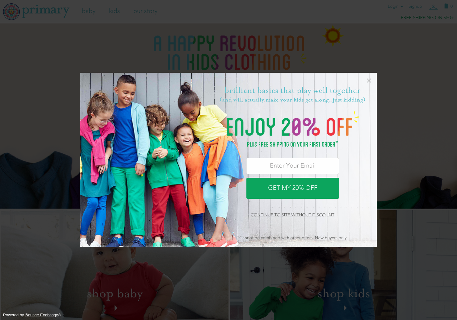
Primary’s signature visual branding
The meaning of colors across cultures
Al tough most people would agree with these basic meanings of colors, there are regional and cultural differences that deserve attention if you operate on a global scale.
Related: Localizing email – tailored marketing by customer location
The perception of color is something people learn within the culture they live in – much like their taste in food or what clothing is acceptable to wear. Some cultures draw their color symbolism from religion or tradition, but what’s important is that what looks cheerful and playful in one culture can mean the opposite in another. Your marketing will benefit from tailoring visual branding and color schemes to be understandable by your target audience in the desires way.
warmth – blue (The Netherlands), yellow (USA), red in most other Western countries
happiness – white (Australia, NZ), yellow (China), red (Japan)
femininity – blue (The Netherlands, Eastern), pink (USA), red (most Western)
masculinity – blue (Sweden, USA), red (UK, France), yellow (Eastern), pink (Belgium)
love – green (Japan), red and purple (China, Korea, Japan and the USA)
marriage – red (China), white (Western)
luck – red (China, Denmark and Argentina), green (most Western cultures due to the four-leaved clover)
high quality, trustworthiness, dependability – blue (US, Japan, Korea), green and yellow (China)
danger – green (Malaysia), red (Western)
mourning/ death (just to have in mind) – red (South Africa), black (Western), white (East Asia), yellow or white (Middle East), purple (Brazil, Thailand)
How to tailor your marketing because of the meaning of colors
Any product’s marketing can benefit from a strategic use of color. Even you as a marketer, applying for a job, can use it to your advantage. Honestly speaking, your CV is also a marketing tool, and color is steadily making its way in job applications and resumes. Colorizing parts of it to highlight your culture fit or personality can have a psychological effect on the recruiter.
A few ideas how to use color in ecommerce marketing:
- Segment your email list and run one campaign in different color schemes for audiences in different countries. For example, a red St. Valentine’s Day one for Western countries and a green one for Japan where this is the color of love.
- Run separate Facebook ad campaigns with different ad visuals for different audiences to trigger the right emotion you’re looking for.
- Think carefully about color options for new product variants – a line of white boating clothes is not suitable for customers in East Asia, for example, where the color is worn in mourning.
- Check if the color you intend to use for a campaign will click with the target market. Blue means cold to most Western cultures in a stark contrast with The Netherlands, where it stands for warmth – a detail that can fail your entire campaign there.
Metrilo will help you filter your customer base any way you need, create specific segments and send them targeted emails for most conversions and repeat orders.
Build and grow your ecommerce brand
Metrilo’s mission is to help you build your ecommerce brand and win your place in the customer’s heart. We share what we learn from our daily work with product innovators and founders here. Subscribe to our weekly newsletter to get the freshest lessons and conquer your niche.
We promise, no spam.
Thank you for subscribing!
See you soon :-)
 eCommerce Metrics ebook
Download
eCommerce Metrics ebook
Download
 Ecommerce customer retention in practice
Download
Ecommerce customer retention in practice
Download
 Ecommerce Growth Helper
Visit
Ecommerce Growth Helper
Visit
 Case studies from our customers
Read
Case studies from our customers
Read