
5 Tips to prepare your ecommerce site for the mobile-first index
As we move through 2018, the importance of preparing your site for the mobile-first index grows every day.
Since the announcement of the move to the mobile-first index way back in November 2016, SEO forums have been awash with comment and speculation about the rollout.
Whilst no fixed date has yet been set, there seems no doubt that the move is imminent and that Google is in fact already rolling this out, although very softly, to specific sites around the world.
Despite the long notice period, there are still so many sites out there who have yet to ‘prepare’ for the rollout, meaning a lot of scrambling could lie ahead.
For ecommerce sites, the job of preparing for the mobile-first index is often much bigger than information-led sites. With hundreds, thousands and possibly millions of product pages, ensuring that those pages are just as crawlable, indexable and ultimately as ‘rankable’ on mobile as they are on desktop is a huge task.
Mobile-first index recap
As you might or might not know, Google will soon be switching from a desktop index to a mobile-first index.
Instead of using the content from your desktop site, Google will be using the content on your mobile site to index and rank your pages.
What does this mean for SEO?
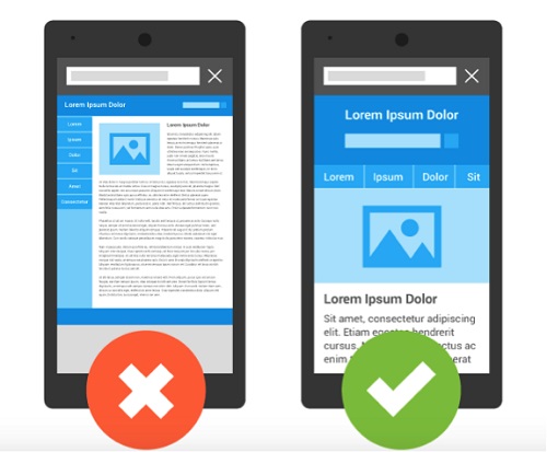
The majority of major ecommerce sites are now ‘mobile-friendly’ meaning they are accessible on a mobile device without the need to pinch and zoom.
There are SEO companies that offer different services such as marketing for accounting firms to simply grow your accounting firm with a constant supply of enquiries from your ideal clients.
This can be done in a couple of ways: mobile-responsive or on a specific mobile site (usually an m. site). Make sure to work with an agency that does ethical link building for SEO.
If you have a fully responsive e-commerce website design, the impact of the mobile-first index will not be that big for you. Theoretically, the responsive version of your site that Google sees on mobile is exactly the same as desktop.
Sometimes, however, designers and developers like to tweak the content that is seen on mobile in order to deliver a better UX so it is still worth carrying out a parity audit of both your desktop and mobile versions to make sure you are not missing a trick.
If you have a separate m. site, then you need to pay close attention. You probably set up that site to deliver a pared-down version of your site on mobile to improve the UX.
If there is a big disparity between the content on your desktop version and your mobile version, however, you could find yourself dropping in the rankings when the new index kicks in.
With this in mind, let’s take a look at how you can prepare for the move to the mobile-first index with some actionable tips that you can start deploying today.
SEO actions to get ready for the mobile-first index
Optimizing for the mobile-first index includes:
- Page Speed
- Conversion Rate Optimization
- Site Search
- Gestures and Keyboards
- Accessibility
1. Page speed
One of the main reasons for shifting to the mobile-first index is Google’s desire to speed up the mobile web.
Faster sites offer a much better user experience (UX) so improving your page load speed will help you rank better in the new mobile-first index.
This is particularly important for ecommerce websites. As mobile traffic has now overtaken desktop, it is going to be crucial to get more people switching over to mobile in order to carry out those all-important conversions rather than switching back to desktop at the purchase stage.
Speeding up the experience is a great way of keeping users engaged on the site and there are a few ways you can do this.
Using tools like Google’s Page Speed Insights, Web Page Test and GT Metrix, you can identify page speed issues and address them.
Some of the most common issues found on sites include:
- Large images – make sure you optimize your images before you add them to your site using tools like Tiny Jpeg or Image Optimizer.
- Slow server response time – no matter how well your pages are optimized, if you have a slow server response time, your pages will always be slow to load.
- Browser caching – you should leverage browser caching that will allow your content, particularly static content, to be fetched a lot quicker.
- Minify key elements – removing unnecessary or redundant data without affecting the way the resource is delivered to the browser is a great way of speeding up your page. Minification can be done on your HTML, CSS and JavaScript.
If you are still finding it hard to speed up your pages, you could also look at new technologies as a potential solution. Things like AMP, PWAs and PWAMP are becoming much more accessible to ecommerce sites as Google attempts to make the mobile web a faster place.
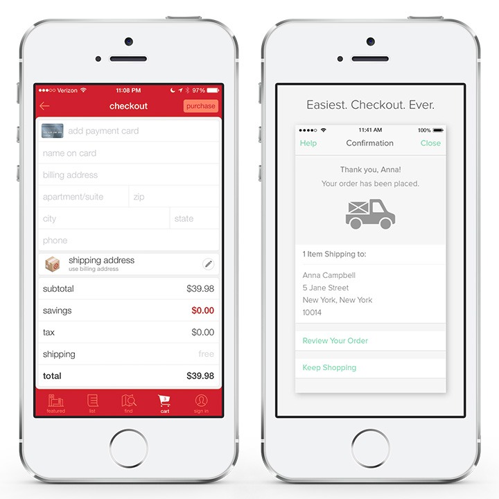
2. Conversion rate optimization
For ecommerce sites, there is typically one goal: a sale. Getting people to convert on a mobile device is a huge signal to Google that your site delivers a great UX that meets the customer’s needs.
There are lots of things you can do to improve conversions on mobile but streamlining the checkout process is the major one. Here are some tactics:
- Ensure the path to conversion from any page on your ecommerce site is no more than 3 clicks away.
- Enable click-to-call by wrapping your phone numbers with tel: links or schema.org markup.
- Cut back on the information you request at check out – keep it to the bare minimum on mobile. Whilst your marketing team may want to collect as much demographic data as possible, do you really need their date of birth? What about those three phone numbers? Make your check out form as simple as possible.
Source: Incomediary
- Provide an option for people to save their basket or create a wishlist so they can complete their transaction on desktop if they feel more comfortable.
- Ensure there are no pop-ups at the checkout stage – the person is just about to convert, do they really need a pop-up to tell them about another product or offer?
3. Site search
Good site search is essential to a great mobile UX. With fewer navigation options to play with, delivering a great site search functionality is key to getting people where you want them to go for ecommerce sites.
A quality internal site search function means that not only can the user find what they are looking for quickly and efficiently, but you can also gather data about the things that people search for, allowing you to refine your navigation, product descriptions and even product offers. Triple winner.
Things to consider for your internal site search include:
- Prominent placement and usable design – your site search must be accessible at all times without scrolling back to the top of the page. The search bar must be big enough to type into and the keyboard that appears – appropriate.
- Allow search within results pages – make sure people can easily refine their search query if their initial search doesn’t deliver what they were looking for.
- Filtering options on the results page – once a search query has been entered, allow users to refine those search results further.
- Auto-complete – this saves time and helps visitors find the closest product to what they want without the frustration of missing the right word.
- Allow for errors – there will always be typos and different ways of spelling words so offer autocorrect to avoid user frustration.
- Faceted sorting of search results – this supports the filtering options above and gives users the option to ‘Sort by’ or ‘Order by’. Amazon does a really good job on this:
 4. Gestures and Keyboards
 4. Gestures and Keyboards
Often overlooked, the way that users interact with your site can make a huge difference to their overall experience, especially for ecommerce sites.
Gestures
Whilst pinching and zooming is often considered a bad thing, many people still pinch and zoom on ecommerce sites when they want to get a real close-up of a product.
A small image with poor resolution and no option to pinch and zoom creates a negative experience and is unlikely to lead to a transaction.
Keyboards
Another area that is easy to overlook is the keyboard you serve the user. Make sure it is fit for purpose.
At the credit card details step at checkout, you need to have a numbers-only keyboard. Likewise, in the email field, give them the keyboard with the ‘@’ sign and the common email ending such as ‘gmail.com’ or ‘hotmail.com’.
5. Accessibility
Crucial to the user experience is the ease of reading the content on your site and engaging with it. SEO content is still a must, but making your content accessible is a key indicator to Google that your site is not only mobile-friendly but mobile-optimized.
Text Size
It is important that the copy is legible without zooming. Use 16px as your base font size and scale relatively as needed and allow your font sizes to scale within the viewport for the best possible experience.
Tap target
There is nothing more frustrating than trying to click on a button on a website and either a) hitting the wrong button because they are too close
or
b) having to zoom in order to hit the button.
Both of these are negative user experience but can be easily remedied by following two easy steps:
- Make tap targets at least 48px wide
- Space tap targets at least 32px apart
Scaling
This is something ecommerce sites need to focus on as we move towards the mobile-first index.
When you are designing new pages, you should always design mobile first and then think about how this will scale to landscape, then to tablet and finally to desktop. Make sure you use every inch of real estate on whatever screen size you are designing for and ensure that when the page scales, it scales to use every inch.
Is your ecommerce site ready for the mobile-first index?
These five tips are just a handful of the things you can be doing to prepare your online store for the mobile-first index. Hopefully, by doing those changes, your ecommerce site will be in a much stronger position once the update is rolled out across websites worldwide.
If you are struggling to start with all this, follow our simple checklist below and start ticking things off:
- Conduct a parity audit of your website, comparing what Google sees when it crawls the mobile and desktop versions of your site.
- Run a number of page speed tests across the key pages on your site, specifically focussing on the mobile speed.
- Conduct a checkout audit – run through the process of purchasing something from your ecommerce site and find ways to simplify it.
- Do some site search testing. Are you getting accurate results? Could you offer more filtering options? Do you find what you are looking for?
- Check out some of your products on mobile. Are they easy to view in full? Is there an option to zoom? Is the information clear?
- Finally, navigate your way around your mobile site. Are the buttons easy to press? Is the text easy to read? Does the site look good in both portrait and landscape?
Once you have ticked off all these, your ecommerce site will not only be mobile-friendly, it will be mobile-first optimized.
This article was contributed by Gavin Hirst.
 Gavin Hirst is a Brit working abroad. He is a copywriter, SEO and content marketing expert working for one of Auckland’s leading SEO agencies, Digital Hothouse in New Zealand. Outside of work, Gavin is a keen golfer and is passionate about the outdoors – hence the move to NZ! Connect with Gavin on LinkedIn or with Digital Hothouse on Twitter and keep up to date with all the latest digital marketing news and trends in NZ and across the world.
Build and grow your ecommerce brand
Metrilo’s mission is to help you build your ecommerce brand and win your place in the customer’s heart. We share what we learn from our daily work with product innovators and founders here. Subscribe to our weekly newsletter to get the freshest lessons and conquer your niche.
We promise, no spam.
Thank you for subscribing!
See you soon :-)
 eCommerce Metrics ebook
Download
eCommerce Metrics ebook
Download
 Ecommerce customer retention in practice
Download
Ecommerce customer retention in practice
Download
 Ecommerce Growth Helper
Visit
Ecommerce Growth Helper
Visit
 Case studies from our customers
Read
Case studies from our customers
Read