
10 Deadly sins of eCommerce CRO every marketer needs to avoid
In this article, we are going to share with you ten unforgivable mistakes in conversion rate optimization (CRO) committed by marketers.
CRO is all the activities that aim to make an online store more user-friendly and better-converting. Clearly, ongoing CRO is critical to keep conversion rate high or increase it, but it’s not as simple as it sounds.
Avoid the following mistakes at all cost if you want customers to make purchases on your online store.
1. Lack of customer reviews and testimonials
Peer opinion, consumer reviews, and public recommendations play an increasingly growing role in influencing purchasing decisions.
A recent survey by Dimensional Research, for example, showed that the majority of participants who have read online reviews were influenced in their purchasing decisions. In fact, this was true for 86 percent of negative reviews and 90 percent of positive reviews!
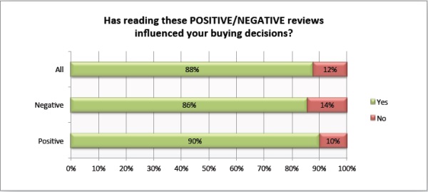
Image Credit: Zendesk
Clearly, customer reviews can increase trust in the quality of your products and services.
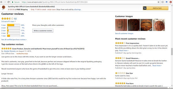
One of the best examples of sites that use reviews and testimonials to build trust is, of course, Amazon. This section is present on every product’s page to provide a viewer with an insight into the quality and inform about experiences of other buyers.
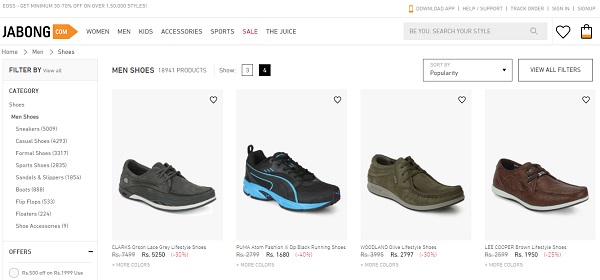
2. Low-quality images
Visuals affect conversions in a profound way. A low-quality image, for example, pixelated, stock, or low-resolution, can quickly persuade a viewer to leave the site.
Well, people hardly purchase anything without seeing first. Given that your store does not have a physical forefront, your customers cannot see the product and understand how it works.
Let’s take a look at images NBA Store used for their basketball shoes:
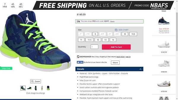
The image of the product is large and can be zoomed in for an even better look. Moreover, the shoes are photographed from various angles to help the viewer get a feel for them.
“In addition to having great photos of your products, you can help customers visualize how they can use it,” says Dennis Greenberg, a senior marketer from Awriter.
3. Forced registration/ account creation
A customer visits your website and try to access a product page but then a message suddenly appears informing them they need to register to continue.
Most people consider registration as a complete waste of time since there are many stores on the net offering the same product. Plus, they don’t all have mandatory registration.
Do you want the first interaction between potential customers and your brand to be like that? You can collect information about them at a later stage, anyway.
Here’s how the NBA Store (mentioned above) solves the problem at checkout:
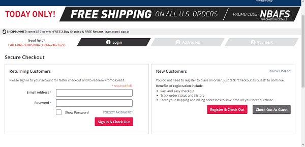
This method completely frees the customer from the requirement of registration but still gets their data. Even if the visitor doesn’t have an account at the store, they can still check out. And they will provide their email for order confirmation.
4. Lack of good product descriptions
Product descriptions are becoming increasingly important these days. They are an underrated part of search engine optimization and persuasion effort of online stores.
Why?
Because they tell the story of what the product is, what benefits it provides to the customer, what problems it solves, etc.
You don’t have to be highly creative with product descriptions but simply describe how the life of the customers will be improved by that product.
One of the most intriguing and concise examples product descriptions out there comes from online retailer ModCloth:
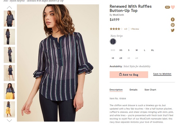 The description appeals to the reader saying that the product is a timeless go-to updated with a fresh look that will give its owner a classic piece with modern elements.
5. Call-to-аction buttons are hard to find
The Call-to-Action (CTA) button is a critical element of any ecommerce website because it allows customers to perform a desired action (buy, subscribe to a newsletter etc.).
A hidden CTA button decreases the chances anyone will click on it so you have to make it visible and prominent.
The organic food seller Verival‘s site is a good example of proper CTA placement and prominence.
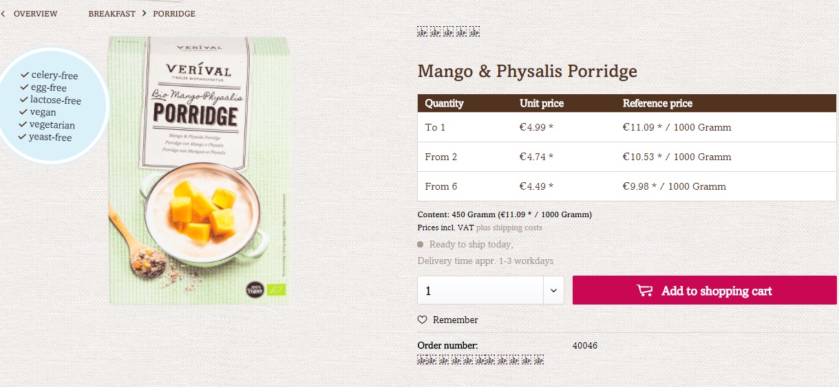
It is a good example because:
- It has a different color than the other elements of the page (the purple color is unmissable!)
- It’s easily accessible.
6. Your site does not create a sense of urgency
By not encouraging customers to buy quickly, you are missing a great opportunity to increase your sales.
There are different ways in which marketers promote the sense of urgency, including:
- Stock scarcity
- Size scarcity
- Time-bound purchase for next-day shipping
- Limited-time discounts
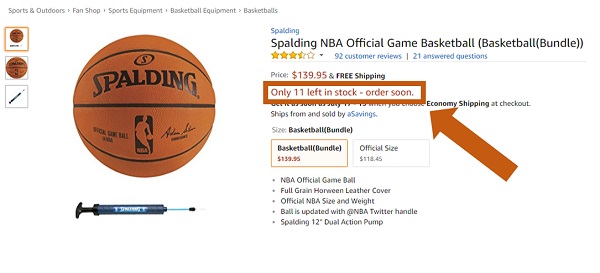
Let’s look at Amazon once again – they’re an example of stock scarcity (see below). And follow the same principle!
7. You overlook the value proposition
Many ecommerce sites have a bad value proposition. However, this is a very risky move because if customers fail to understand the unique features of your brand, you are going to be just another company in the sea of others.
To avoid that, make sure you have a value proposition that differentiates your products or services. This way you don’t have to compete on price alone.
Holstee is a good example in this case because all its products are created around the theme of mindfulness and draw their distinctive character from there.

8. Complicated checkout process
A complicated checkout process is another revenue killer. It is one of the main reasons why shopping cart abandonment is so high these days.
For example, more than 60 percent of visitors who add products to shopping carts never checkout.
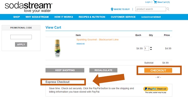
That’s why you need to make checkout process on your site as easy as possible and provide express checkout options. Here’s how Soda Stream does it:
9. Complicated navigation
As a marketer, your main goal is to persuade the customer to buy a product as quickly as you can. The longer they browse the website, the more time they have to change their mind about purchasing.
Let them decide faster by losing drop-down product menu categories and subcategories. Your site should display products right from the start like this:
10. Your store changes too many design elements
Changes are good. They improve your site and make it easier for customers to interact with it. However, some marketers make too many changes at once, which may confuse visitors.
Unless the company agrees to a complete rebranding, dramatic changes in the design of an ecommerce store are not desirable because they can lead to many customers losing their way around and churning.
 This article has been contributed by
Lucy Benton
She is a marketing specialist, a business consultant, and currently works at Assignment Helper. Find Lucy on FaceBook and Twitter
Build and grow your ecommerce brand
Metrilo’s mission is to help you build your ecommerce brand and win your place in the customer’s heart. We share what we learn from our daily work with product innovators and founders here. Subscribe to our weekly newsletter to get the freshest lessons and conquer your niche.
We promise, no spam.
Thank you for subscribing!
See you soon :-)
 eCommerce Metrics ebook
Download
eCommerce Metrics ebook
Download
 Ecommerce customer retention in practice
Download
Ecommerce customer retention in practice
Download
 Ecommerce Growth Helper
Visit
Ecommerce Growth Helper
Visit
 Case studies from our customers
Read
Case studies from our customers
Read